2016 Update:
It’s that time of year again! We all know when the Pumpkin Spice Lattes start flowing, the storms start rolling in too. I wrote this article last year to track hurricane Joaquin, which turned out to be a miss in my area. As we look at hurricane Matthew, it really is too soon to tell what the impact will be to most of the United States. If you want to follow along, these tips from last year all still apply. The only change I made was to the link that looked at the NHC archive for Joaquin specifically. Now that link thats you to the archive for the 2016 storm season, which also has previous seasons accessible.
The internet is a wonderful tool, and can be used many, many different ways, just please don’t google your cold symptoms or you’re going to convince yourself you have Ebola!
Being a science and technology nerd, and having dealt with Superstorm Sandy several years ago, I set out to try and figure out the best way to track a hurricane online from the comfort of my own home (until the power goes out due to said hurricane, of course). It looks like I may be in the path of Hurricane Joaquin, so I’ve been stalking it for the last day or so. Here are a few resources I’ve found and liked.
The Cool Looking “Where is it going?”
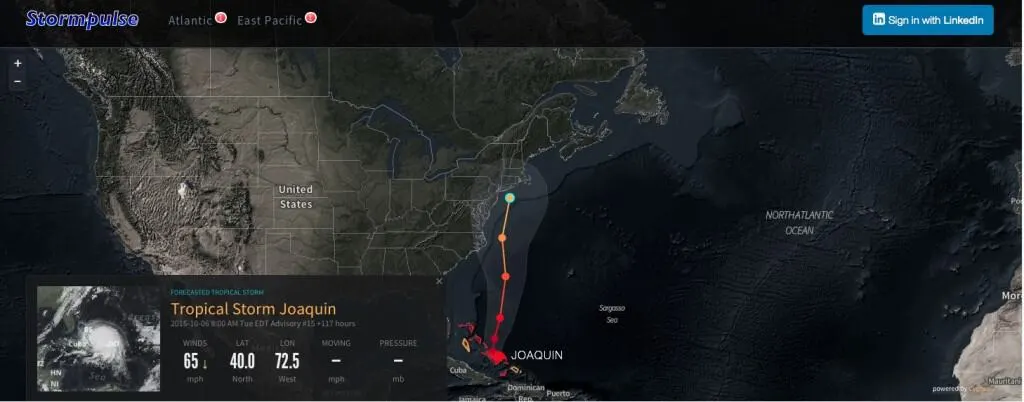
I found a site called StormPulse.com a number of years ago when I was tracking a hurricane I shared a name with. While they do have a subscription model, you can view active storms and a predicted path in an easy to view manner. Judging by the notation when you zoom in on a map, StormPulse is using NOAA/NHC (National Weather Service/National Hurricane Center which is a US based organization) data. Below is what you see on the StormPulse website, without logging in:
 (Image from StormPulse.com, use it to track hurricane Joaquin here)
According to this, Joaquin will be arriving in my area as a tropical storm at around 8 AM Tuesday.
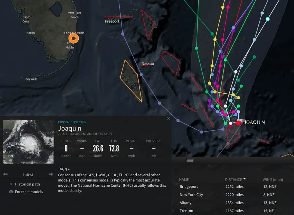
If you are willing to log in with your LinkedIn account, you’ll get a greatly enhanced view, and an option to view all of the prediction models on the same map, and information on each model:
 (Image from StormPulse.com, after sign in with LinkedIn)
StormPulse is a great, easy to use interface with lots of great data from the NOAA, and tracks active and pacific storms. I highly recommend it, especially if you don’t mind logging in with your LinkedIn account.
More on NOAA/NHC
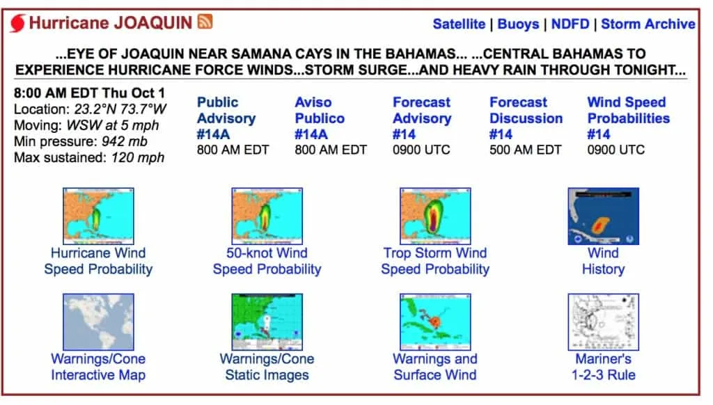
I also like the NOAA/NHC, which is sometimes called the GFS model, however the raw data isn’t as user friendly as it is with the StormPulse.com interface. One of the great things about NHC is the frequency of updates, which come in an intermediate and full advisory form and are all accessible from their website. You can access this information by going to http://www.nhc.noaa.gov, and you’ll see all of the active storms as soon as you load the page. The text based advisory itself mainly focuses on where the hurricane is right now, and predictions for the not so distant future. With each update, a number of maps are also available. Here’s what is available beyond the text advisory for Joaquin:
 (Image from the NOAA’s National Hurricane Center landing page)
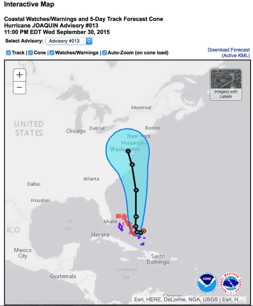
While all of the maps are really interesting to look at, the Warnings/Cone Static Images map is the easiest to use to get an idea of where the NHC is currently predicting the hurricane will go. There’s also an (NOTE: archive link updated for 2016) archive of the advisories, so you can track how the model has changed during the progression of the storm. If you click on Interactive Map from the Warnings/Cone Static Images map, you’ll have a drop down menu that allows you to pick the advisory you want to view, which gives you a much more visual idea of how the storm has been changing. There’s also a KML file you can download to put the data into something like Google Earth on your computer.
 (NHC’s Interactive Map)
The European Model
There’s been a lot of buzz about the “European model” for hurricane prediction lately. That’s because this model, generated by the European Centre for Medium-Range Weather Forecasts (ECMWF) accurately predicted the path of Hurricane Sandy way before anyone else did. At the time, they utilized an IBM super computer with 600 teraflops of computing power, and in December of 2013 they began the install of a Cray supercomputer. They actually have two Cray XC30 systems because who doesn’t want a redundant super computer. To find out more about their super computing facilities, you can browse their website here.
ECMWF runs their predictions twice a day, at 0 GMT and 12 GMT, with charts available about half an hour after each run. You can access their medium-range charts here directly, but they take a little bit more effort to read and interpret. ECMWF even lets you access the map as a PDF for your viewing pleasure!
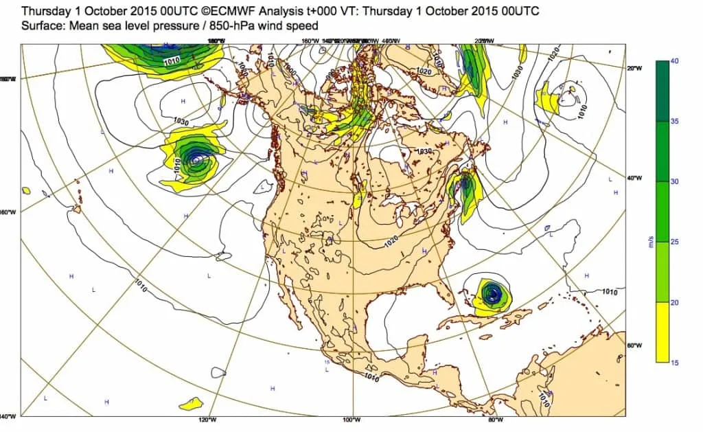 (ECMWF data map, in PDF located here)
You can find a number of different interpretations of the data online, and one good place to start is MyFoxHurricaine.com. They show a spherical view of the model, and allow you to step through it for the next several days.
But Wait! There’s More!
These are only two of the models that can be used for hurricane prediction. Many websites out there, such as MyFoxHurricaine.com allow you to view multiple models, so you can get a feel for what each model is saying. If you want to learn more about different models out there, take a look at this article on Weather Underground.
However you like to consume your data, there is a storm tracking site out there for you! I like to use a combo of StormPulse.com, NHC, and ECMWF. I’m fascinated with how these storms work, and the technology we can use to learn about them and predict them. Hopefully I won’t actually have to deal with one anytime soon. Happy Hurricane season, and stay dry!

Melissa is an Independent Technology Analyst & Content Creator, focused on IT infrastructure and information security. She is a VMware Certified Design Expert (VCDX-236) and has spent her career focused on the full IT infrastructure stack.
